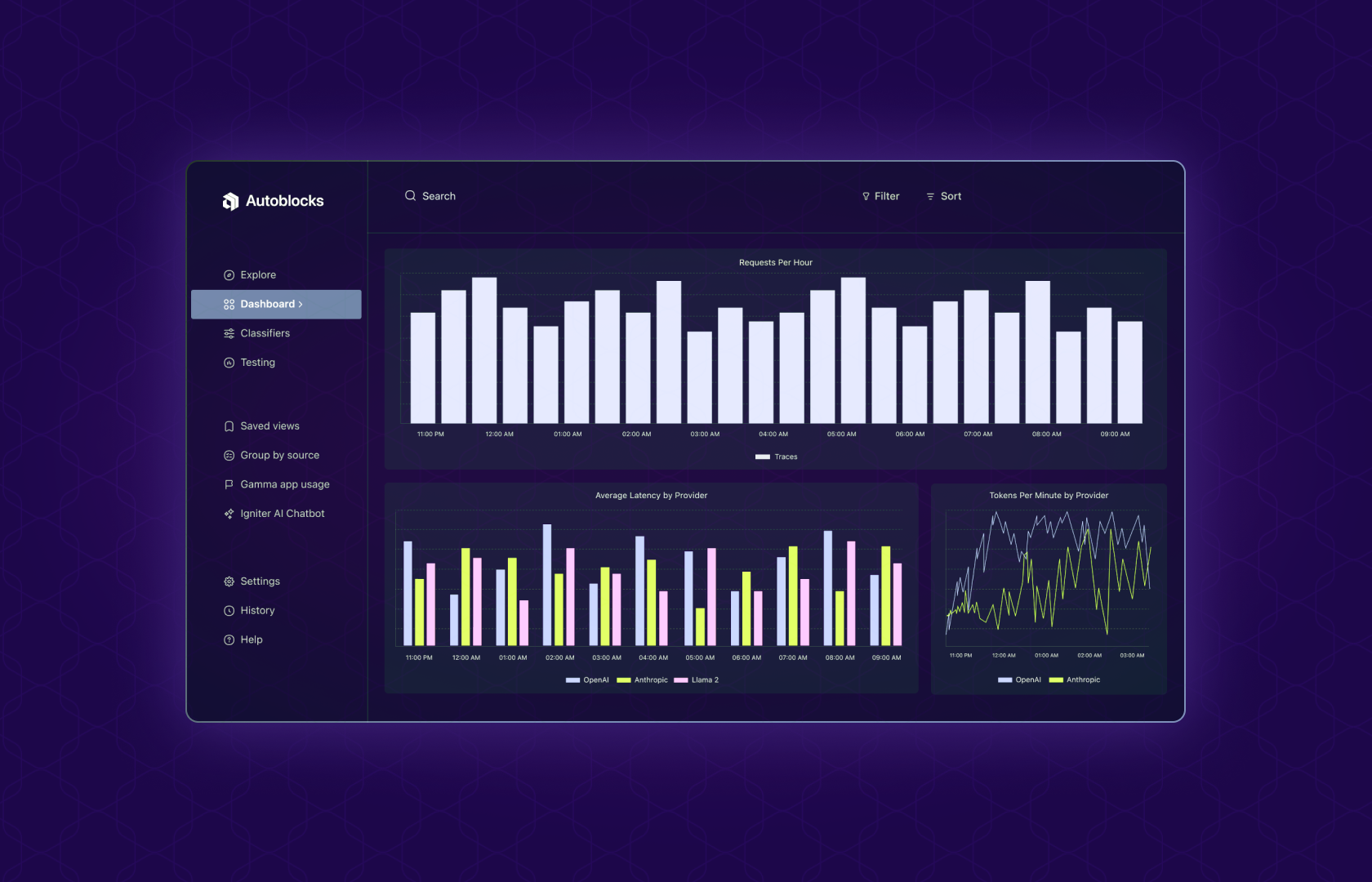
Our dashboard functionality offers a bird's eye view of your real-time LLM models' performance. With intuitive tools, you can monitor trends, identify weak spots, and enhance the success rate of your outputs.
Tracking Implicit Feedback: Copywriting Product
If you're building a copywriting product and tracking an event, output_accepted, that signifies whether a user accepted or rejected your suggestion, you can create a visualization as follows:
- Filter Events: Go to the Explore page and filter for traces where
output_accepted = False. - Choose Line Graph: Select Line as the Chart Type for clear trend visualization.
- Visualize Percentage: Under Visualize, choose “Percent Of” and define “Filter Group 1 is what % of Unfiltered.”
This line graph displays the percentage of rejected outputs, clearly showing how your suggestions are received over time.
Tracking Explicit Feedback: Customer Service Chatbot
If you're running a customer service chatbot and tracking an event, user_feedback, representing thumbs-up or thumbs-down reactions, you can create a visualization as follows:
- Filter Events: Filter for traces where
user_feedback != ""to only see traces with explicit feedback. - Choose Stacked Bar Chart: Select Stacked Bar as the Chart Type to easily compare positive and negative feedback.
- Visualize Count: Under Visualize, choose "Count" to see the volume of each type of feedback.
This stacked bar chart lets you see the magnitude of dissatisfied versus satisfied users over time.
Conclusion
With rich telemetry data at your disposal, you can derive direct or indirect metrics to gauge the effectiveness and appropriateness of your product’s outputs. These insights help fine-tune your models' performance to align with user needs better.

